This UI/UX project was designed in George Brown College’s Interaction Design class.
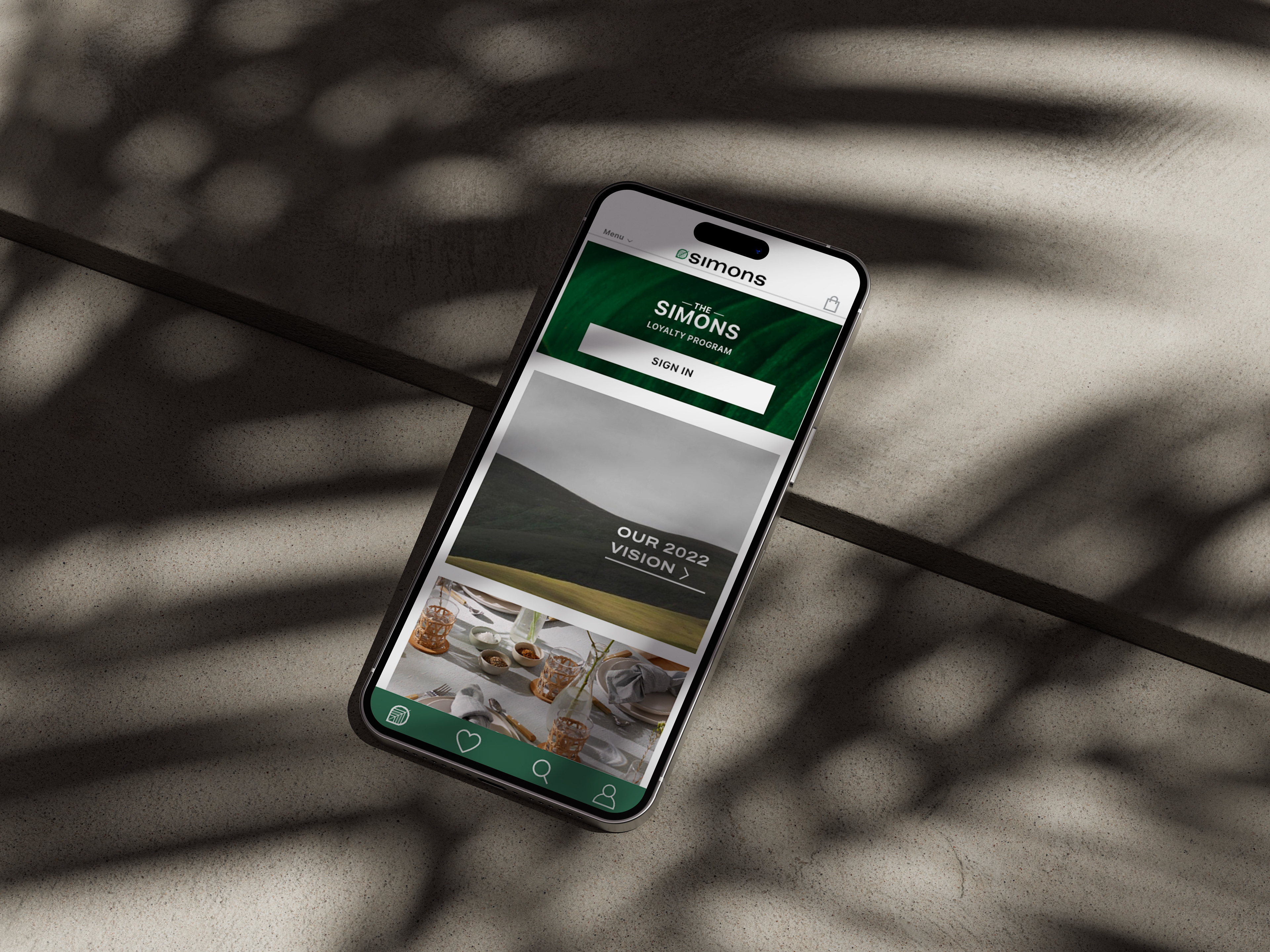
The goal was to design an app of my choosing that could benefit from a redesign in both the aesthetic purposes, but more importantly to improve the ways in which users interact with the app. The company chosen was Simons’, a Montreal based Canadian department store, mobile app. Through prototyping, site maps, and persona research some of the key issues found within Simons’ original app was to refine the amount of items in each menu, allow users to navigate easily on the app without the feeling of getting overwhelmed, and to display a brand presence. Through strategic colour, layout organization, and photography the app has become streamlined and more user friendly.
ROUGH WORK
01
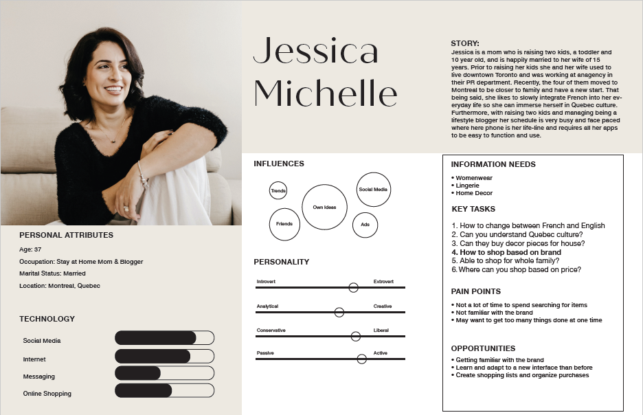
PERSONAS
_____________________
Created a series of three personas varying in age, lifestyle,and income for whom Simons’ audience is. By doing this it helped to better understand the type of people using the app and in turn helps to cater to them
02
USER FLOW
_______________________
Once understanding who Simons’ audience is, a set of three tasks per persona are tested on the current state of the app to recognize areas of improvement or streamline the app based on how the user interacts with the app.
01 PERSONAS

02 USERFLOW
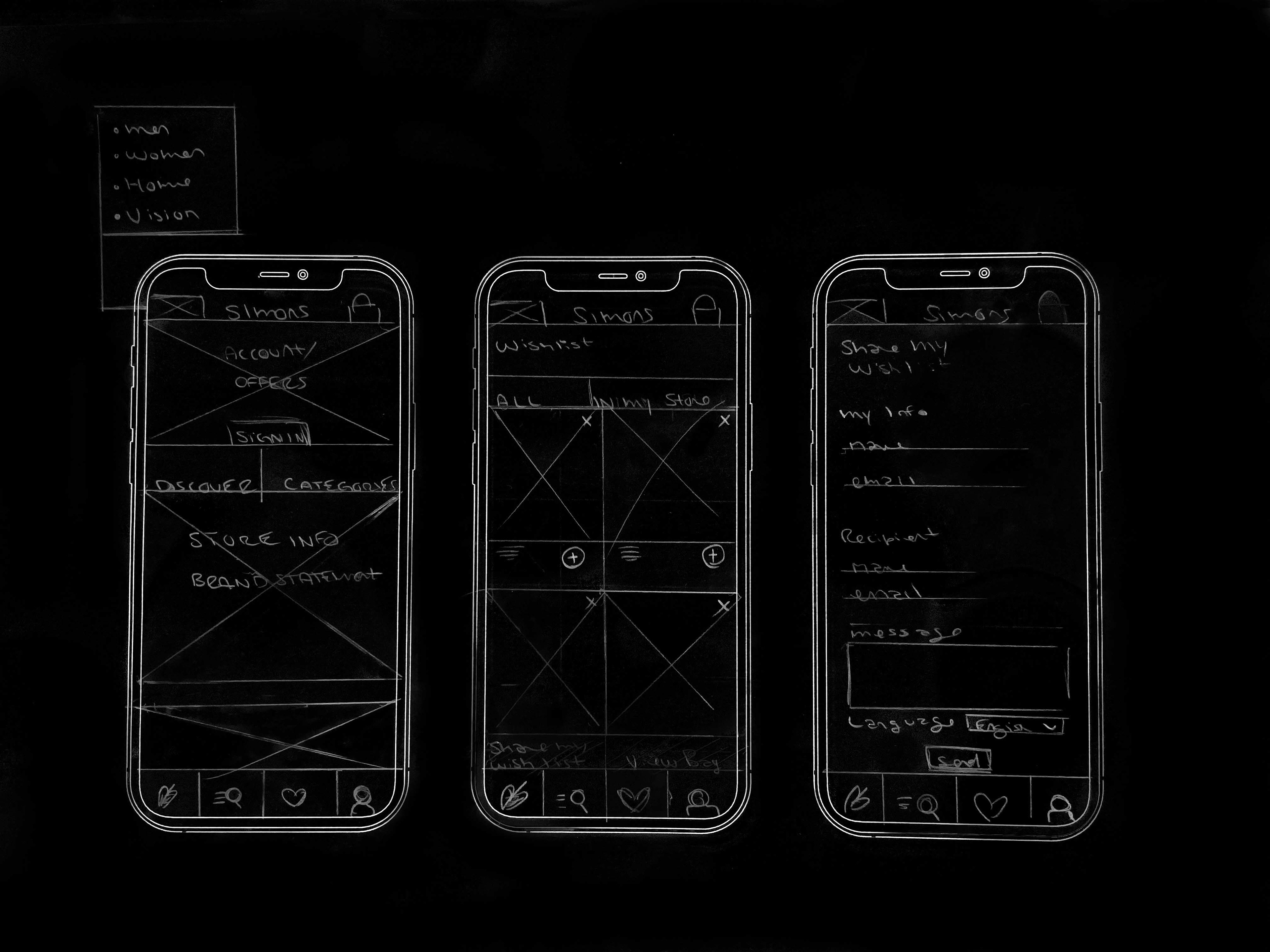
03
SKETCHES
________________________
Illustrated possible layout variations and design elements that could be incorporated into the new app. This included a new menu options, icon styles, and imagery placements.
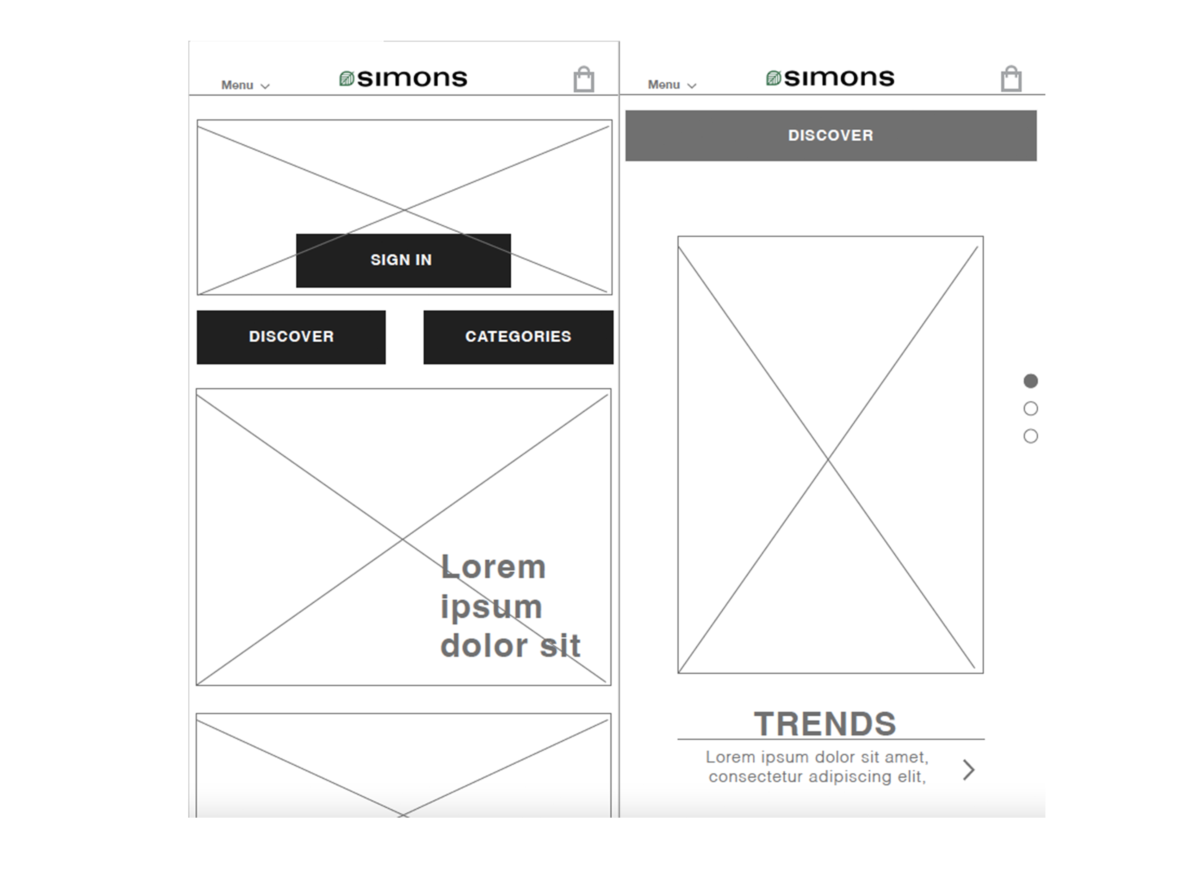
04
WIREFRAMING
________________________
Once the layout had been finalized through sketches, they then got translated into digital wireframes. The process became a digital map of where buttons will go, imagery, text, and how pages will interact with one another.
03 SKETCHES
04 WIREFRAMES